Reimagining the browser for productivity
Creating a set of features to increase productivity in the browser.
Role
Product designer
Proyect
Brave browser
Year
2022-2023
In today's landscape of multi-tasking, cognitive overload and divided attention, the traditional horizontal tab design had begun showing its limitations. I worked on enabling new ways to browse and making the browser work better for users' streams of work through a new set of complementary features: vertical tabs, split view, and sidebar browsing. These improvements help users manage their tabs more effectively and create a more natural workflow for complex tasks.
At the time of publishing this case study, some of the features are only available in the alpha channel of the browser, but we've gotten really good user feedback about the features and how they've helped users in their workflows.
Impact and results
The implementation of the features that'll be the detailed have significantly enhanced the Brave browsing experience:
Users can better manage larger numbers of tabs
Side-by-side comparison of web pages is seamless
Screen space is used more effectively
The browsing experience feels more modern and organized
Something very important to keep always in mind, it's not one-size-fits-all. Different users might like a feature and not the others, and that's fine. The goal is to help users figure out their best workflow in their own way.
Lessons learned
This project reinforced several key principles about browser design and user experience. We found that challenging established patterns, like the traditional tab design, can open doors to meaningful innovation when approached thoughtfully.
The process also revealed how design solutions often yield unexpected benefits across different features - the pill design we created for vertical tabs naturally evolved to enhance our split view functionality. Perhaps most importantly, we learned the art of maintaining visual consistency while introducing new functionality, ensuring that innovations feel like natural extensions of the browser rather than patched up features.
The challenge
Brave, built on Chromium, inherited the classic horizontal tab design that has been a browser standard for decades. However, modern web usage patterns revealed several limitations:
Screen real estate wasn't being used efficiently, especially on widescreen displays.
Tab management became unwieldy with multiple open tabs that a lot of our tab hoarders have to deal with.
The traditional tab design didn't accommodate newer browsing patterns like side-by-side comparisons, or being able to reference content from other tabs.
Design process
Phase 1: vertical tabs
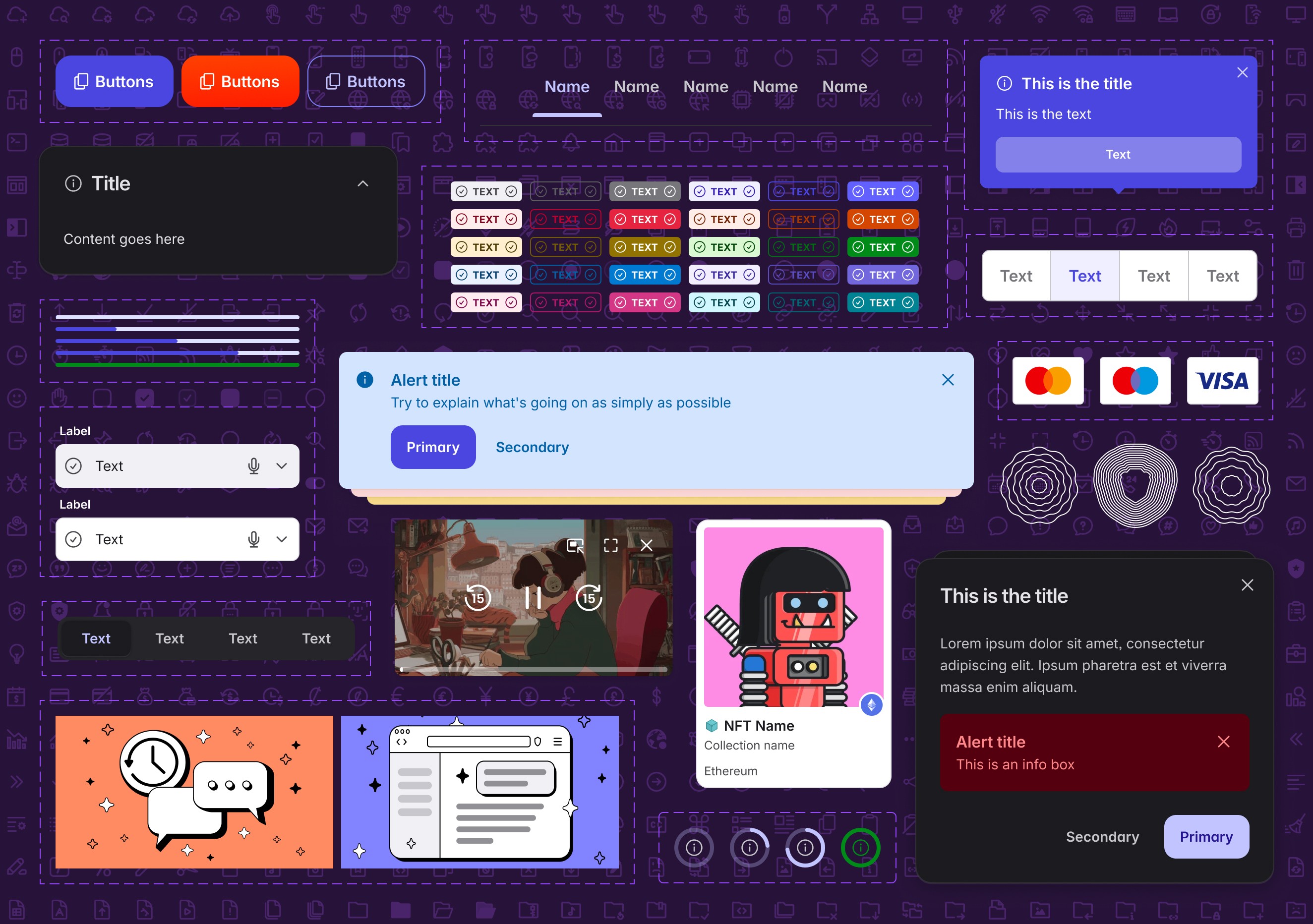
The first major challenge was reconceptualizing how tabs could work in a vertical orientation. The existing horizontal tab design, with its connected edge to the content area, wouldn't translate effectively to a vertical layout. This led to the development of the "pill" design concept.
The pill-shaped tab represented a significant departure from traditional browser tabs. Instead of appearing attached to the content area, these tabs float independently in the tab bar, creating a more abstract visual representation of the relationship between the tab and content. Although controversial, this design choice had several advantages:
Improved scalability for multiple tabs.
Clearer visual separation between navigation and content.
More efficient use of vertical space.
A detachment of the 1:1 relationship between a tab and the content window.
This new pill shape design worked really well for vertical tabs, and I had the theory that it would also work really well in horizontal tabs. I kept that idea in my sleeve for features that were yet to come.
Phase 2: content area adaptation
With the introduction of vertical tabs, the main content area required careful reconsideration. We needed to:
Add appropriate padding to accommodate the vertical tab list.
Create a subtle separation between content and sidebar. The content of the website should never be confused with some other part of the browser UI.
Ensure the content area remains responsive to different window sizes.
Maintain a clean, uncluttered appearance despite the additional UI elements.
Phase 3: Unifying the Tab Design Language
The success of the pill-shaped design in vertical tabs revealed an opportunity to create a more cohesive browsing experience.
We realized that bringing this same design language to horizontal tabs would not only create visual consistency but also prepare the groundwork for future features. By disconnecting tabs from the content area and giving them the same pill-shaped appearance as their vertical counterparts, we created a more flexible foundation for upcoming features like split view.
This unified design approach offered several advantages. First, it made the interface more intuitive – users who were familiar with one tab style could easily understand the other. Second, it created a more modern, cleaner aesthetic throughout the browser. Most importantly, it established a design pattern that could accommodate future innovations in tab management and window organization without feeling disjointed or like a patchwork of features.
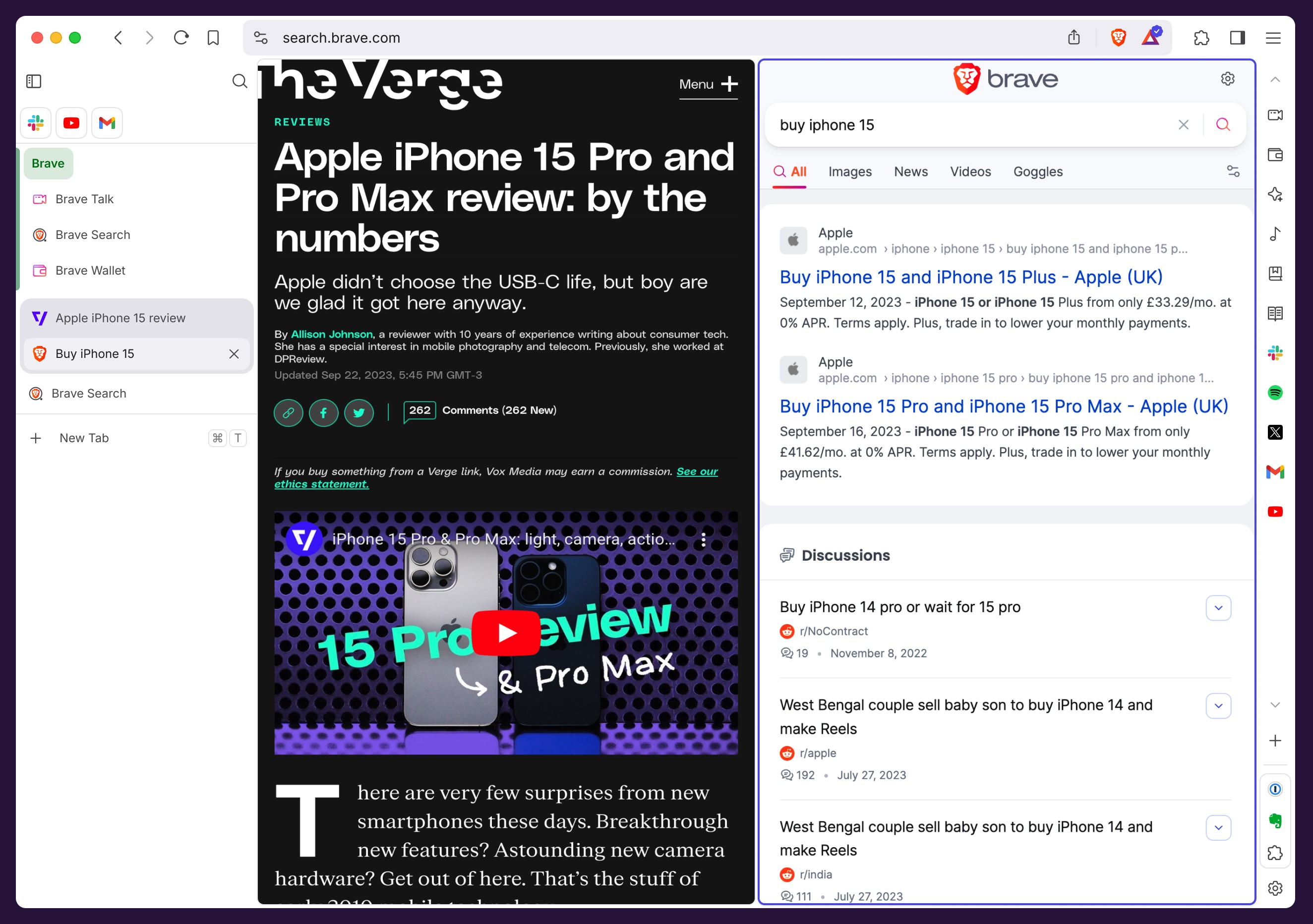
The transformation of horizontal tabs into the pill design was particularly crucial for split view functionality. When users divide their screen between multiple web pages, the detached tab design makes it visually clear which tabs belong to which content area, while maintaining the sleek, contemporary feel of the browser interface.
Phase 4: split view

The success of the pill design in vertical and horizontal tabs led to the creation of the split view feature. This required solving several design challenges: Creating a visual system to indicate grouped tabs, maintaining clarity in the tab strip for split view states, ensuring smooth transitions between different view modes, and developing intuitive controls for split view management.
The solution involved introducing a subtle grouping indicator in the tab strip, visually connecting related tabs while maintaining the clean aesthetic of the pill design.
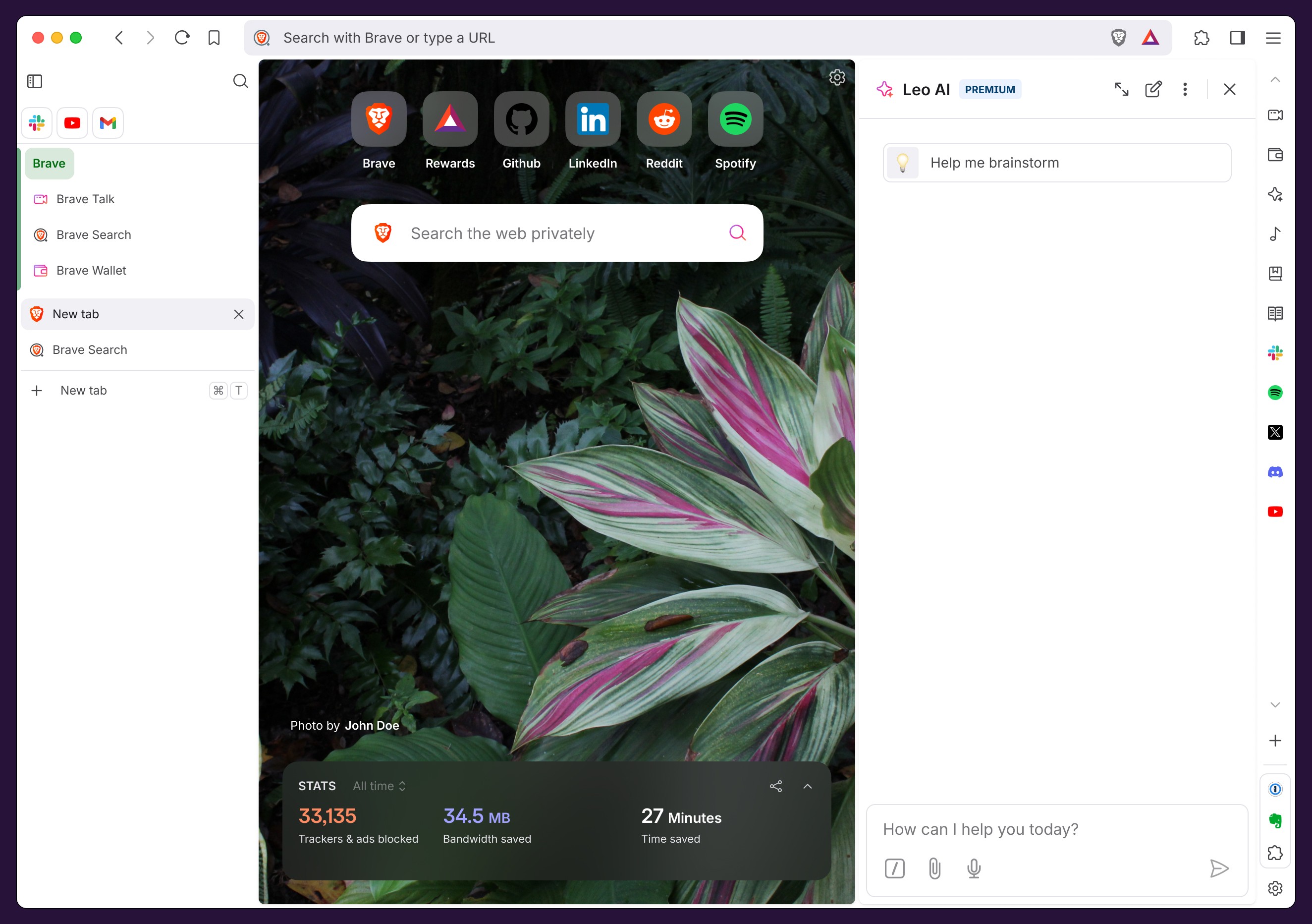
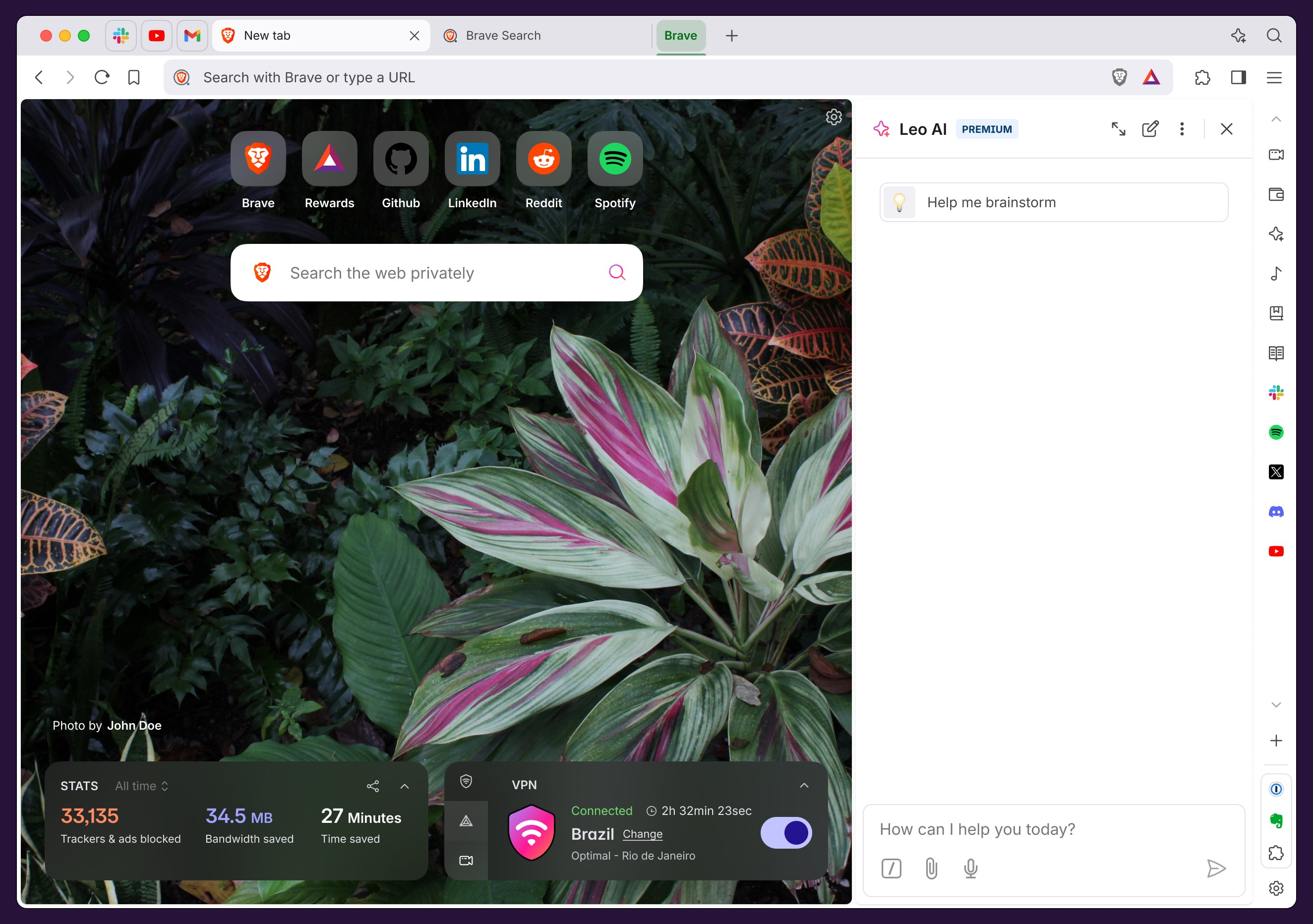
Phase 5: sidebar browsing
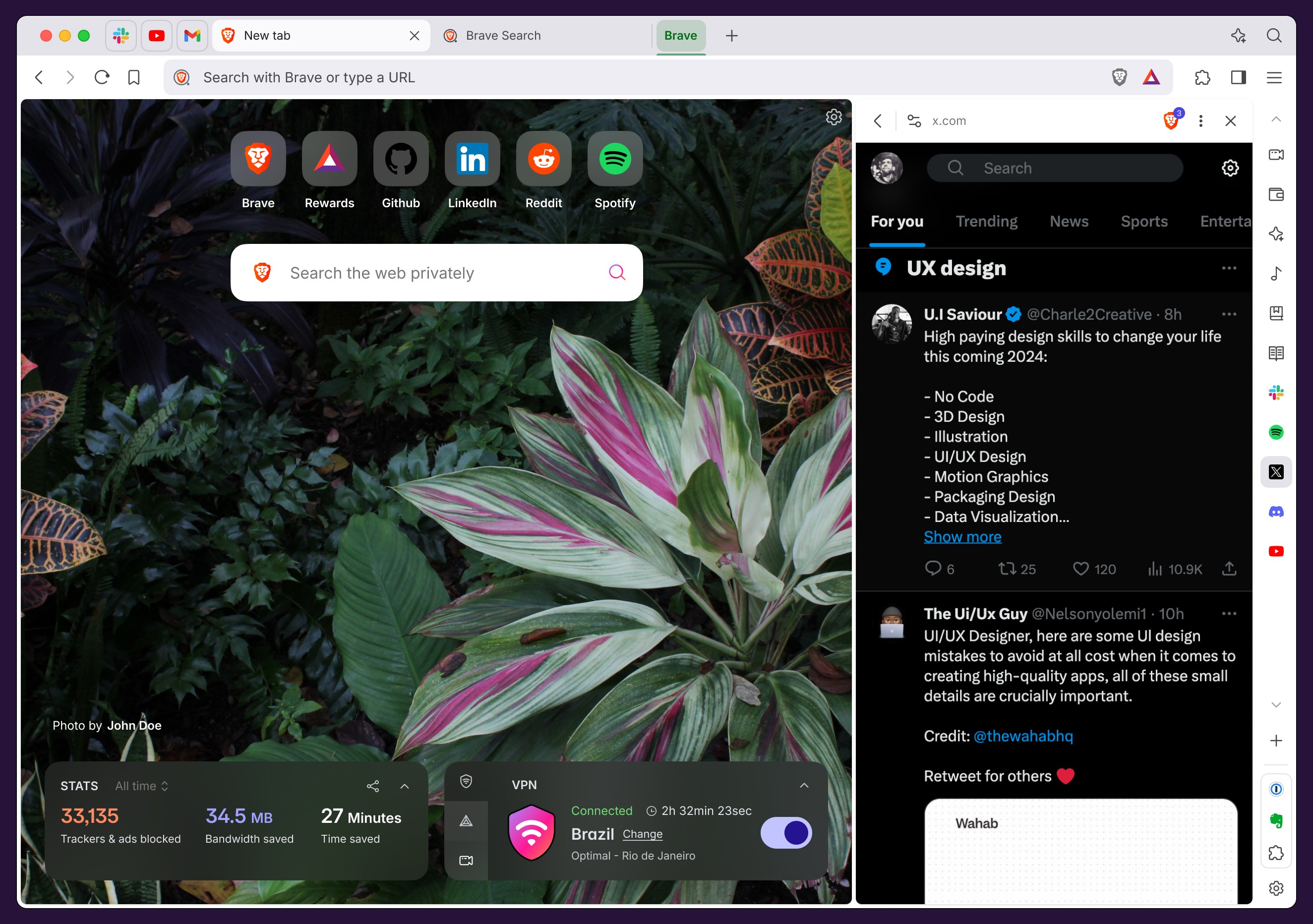
As we observed how users managed their workflows, we noticed a common pattern: they frequently switched between their main browsing activity and reference materials or tools they needed to keep readily available. This insight led to the development of sidebar browsing, a feature that fundamentally changes how users can maintain context while navigating the web.
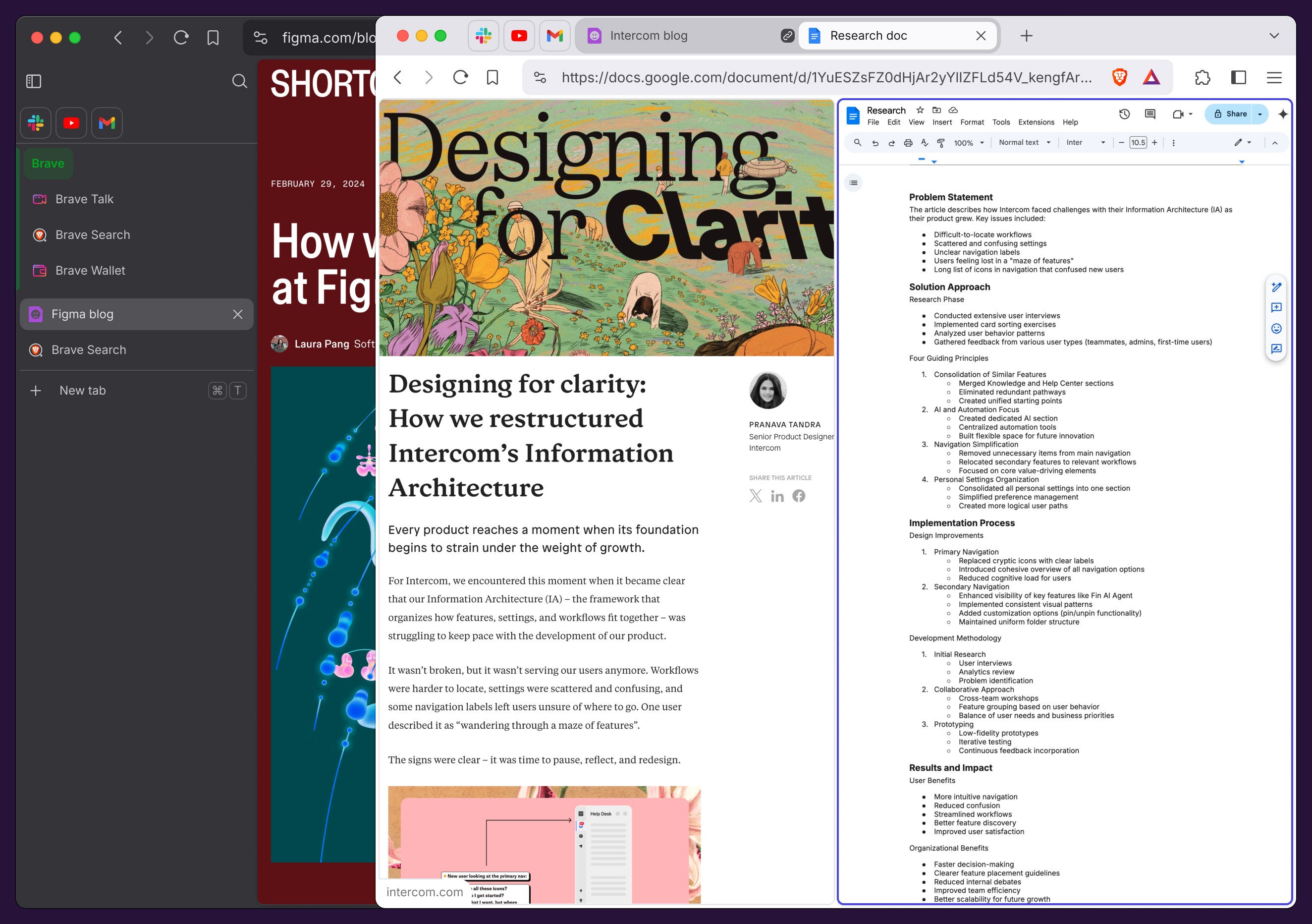
Sidebar browsing introduces a new way to keep frequently accessed content within reach. Think of it as having a persistent set of compact windows that live in your browser's sidebar. These miniature versions of websites remain accessible regardless of what's happening in your main browsing window. For instance, a user writing a research paper could keep a Google Doc continuously visible in the sidebar while searching for references in their main browser window.
This eliminates the cognitive overhead of constantly switching between tabs and helps maintain focus on the primary task. Not to mention that users can now have multiple contents without having to deal with managing multiple windows at the OS level.
The design challenge lay in creating an experience that felt natural and unobtrusive. We needed to ensure these sidebar items remained easily accessible without competing with the main content for attention. This led to several key design decisions:
The sidebar tabs maintain their own independent state from the main browsing session, allowing users to treat them as persistent tools rather than temporary pages.
We implemented a compact view that preserves the essential functionality of these sites while fitting comfortably in the reduced space.
The visual design maintains consistency with our pill-shaped tab aesthetic while clearly distinguishing these persistent views from regular tabs.
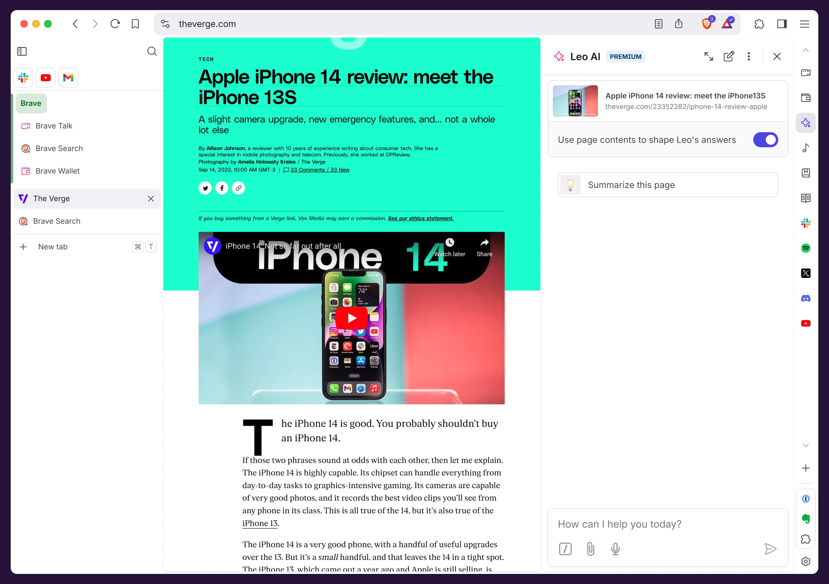
Take advantage of the browser sidebar that Brave currently has, and it's not really being taken advantage of for websites. It's only very relevant for using our AI assistant and a handful of small features, but web shortcuts would just open in new tabs.
The feature particularly shines in scenarios where users need to reference, monitor, or interact with multiple sources simultaneously. A developer might keep documentation visible while coding, a student could maintain note-taking tools while researching, or a financial analyst could monitor market data while reviewing reports.
The challenge
Brave, built on Chromium, inherited the classic horizontal tab design that has been a browser standard for decades. However, modern web usage patterns revealed several limitations:
Screen real estate wasn't being used efficiently, especially on widescreen displays.
Tab management became unwieldy with multiple open tabs that a lot of our tab hoarders have to deal with.
The traditional tab design didn't accommodate newer browsing patterns like side-by-side comparisons, or being able to reference content from other tabs.
Design process
Phase 1: vertical tabs
The first major challenge was reconceptualizing how tabs could work in a vertical orientation. The existing horizontal tab design, with its connected edge to the content area, wouldn't translate effectively to a vertical layout. This led to the development of the "pill" design concept.
The pill-shaped tab represented a significant departure from traditional browser tabs. Instead of appearing attached to the content area, these tabs float independently in the tab bar, creating a more abstract visual representation of the relationship between the tab and content. Although controversial, this design choice had several advantages:
Improved scalability for multiple tabs.
Clearer visual separation between navigation and content.
More efficient use of vertical space.
A detachment of the 1:1 relationship between a tab and the content window.
This new pill shape design worked really well for vertical tabs, and I had the theory that it would also work really well in horizontal tabs. I kept that idea in my sleeve for features that were yet to come.
Phase 2: content area adaptation
With the introduction of vertical tabs, the main content area required careful reconsideration. We needed to:
Add appropriate padding to accommodate the vertical tab list.
Create a subtle separation between content and sidebar. The content of the website should never be confused with some other part of the browser UI.
Ensure the content area remains responsive to different window sizes.
Maintain a clean, uncluttered appearance despite the additional UI elements.
Phase 3: Unifying the Tab Design Language
The success of the pill-shaped design in vertical tabs revealed an opportunity to create a more cohesive browsing experience.
We realized that bringing this same design language to horizontal tabs would not only create visual consistency but also prepare the groundwork for future features. By disconnecting tabs from the content area and giving them the same pill-shaped appearance as their vertical counterparts, we created a more flexible foundation for upcoming features like split view.
This unified design approach offered several advantages. First, it made the interface more intuitive – users who were familiar with one tab style could easily understand the other. Second, it created a more modern, cleaner aesthetic throughout the browser. Most importantly, it established a design pattern that could accommodate future innovations in tab management and window organization without feeling disjointed or like a patchwork of features.
The transformation of horizontal tabs into the pill design was particularly crucial for split view functionality. When users divide their screen between multiple web pages, the detached tab design makes it visually clear which tabs belong to which content area, while maintaining the sleek, contemporary feel of the browser interface.
Phase 4: split view
The success of the pill design in vertical and horizontal tabs led to the creation of the split view feature. This required solving several design challenges: Creating a visual system to indicate grouped tabs, maintaining clarity in the tab strip for split view states, ensuring smooth transitions between different view modes, and developing intuitive controls for split view management.
The solution involved introducing a subtle grouping indicator in the tab strip, visually connecting related tabs while maintaining the clean aesthetic of the pill design.
Phase 5: sidebar browsing
As we observed how users managed their workflows, we noticed a common pattern: they frequently switched between their main browsing activity and reference materials or tools they needed to keep readily available. This insight led to the development of sidebar browsing, a feature that fundamentally changes how users can maintain context while navigating the web.
Sidebar browsing introduces a new way to keep frequently accessed content within reach. Think of it as having a persistent set of compact windows that live in your browser's sidebar. These miniature versions of websites remain accessible regardless of what's happening in your main browsing window. For instance, a user writing a research paper could keep a Google Doc continuously visible in the sidebar while searching for references in their main browser window.
This eliminates the cognitive overhead of constantly switching between tabs and helps maintain focus on the primary task. Not to mention that users can now have multiple contents without having to deal with managing multiple windows at the OS level.
The design challenge lay in creating an experience that felt natural and unobtrusive. We needed to ensure these sidebar items remained easily accessible without competing with the main content for attention. This led to several key design decisions:
The sidebar tabs maintain their own independent state from the main browsing session, allowing users to treat them as persistent tools rather than temporary pages.
We implemented a compact view that preserves the essential functionality of these sites while fitting comfortably in the reduced space.
The visual design maintains consistency with our pill-shaped tab aesthetic while clearly distinguishing these persistent views from regular tabs.
Take advantage of the browser sidebar that Brave currently has, and it's not really being taken advantage of for websites. It's only very relevant for using our AI assistant and a handful of small features, but web shortcuts would just open in new tabs.
The feature particularly shines in scenarios where users need to reference, monitor, or interact with multiple sources simultaneously. A developer might keep documentation visible while coding, a student could maintain note-taking tools while researching, or a financial analyst could monitor market data while reviewing reports.
Future considerations
As web browsing continues to evolve, these features lay the groundwork for future innovations in browser interface design. The introduction of artificial intelligence presents exciting opportunities for features like smarter tab organization.
We're exploring systems that could automatically group tabs based on related topics or domains, helping users maintain focus while researching specific subjects. For instance, when a user is planning a trip, the browser could intelligently cluster all travel-related tabs together, from flight bookings to hotel reviews and local attractions.
Beyond AI-driven organization, we're investigating ways to enhance the split view functionality to support more complex workflows. This could include customizable layouts that adapt to different types of content, such as a three-panel view for comparing products with an AI generated layout that doesn't depend on the websites you're visiting, but rather a completely new UI to just focus on the task at hand.
This project demonstrates how design can significantly improve the core browsing functionality while maintaining familiarity for users transitioning from the more massive, default browsers.
More projects
CASE STUDY
Brave's Design System
Creating Nala: One design system to rule all our platforms and products.

CASE STUDY
An AI agent that flows with you
How we created an AI agent that doesn't get in your way and helps you work better.
Custom browser icons
Adding fun ways to customize your home screen experience.
Leo AI webapp
Creating a more comfortable UI for deep work with AI.
Contextual conversations with Leo AI
How we created an UX for easily adding the context of a webpage to an AI conversation.