Brave's Design System
Creating Nala: One design system to rule all our platforms and products.
Role
DesignOps
Proyect
Brave Software
Year
2022 - Ongoing


Nala: a three-layer approach
Rather than creating a one-size-fits-all solution, I developed a three-level architecture that balanced consistency with flexibility:
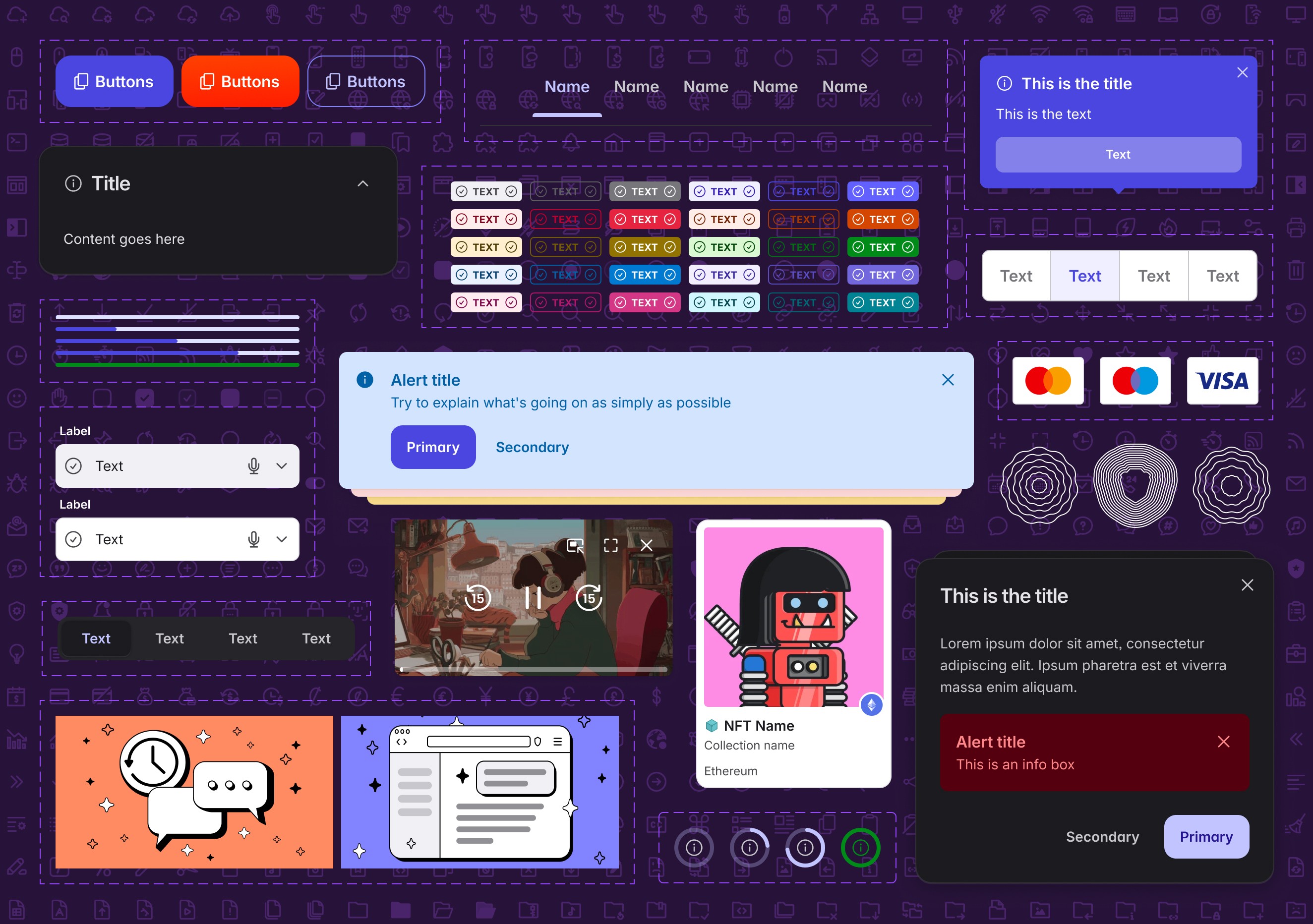
Universal foundation
At the core of Nala lies a universal library containing shared elements that maintain consistency across all Brave products:
A perceptually uniform color system with predictable contrast ratios.
Typography foundations.
Basic components (buttons, inputs, tooltips, illustrations, icons, etc.).
Cross-platform design tokens.
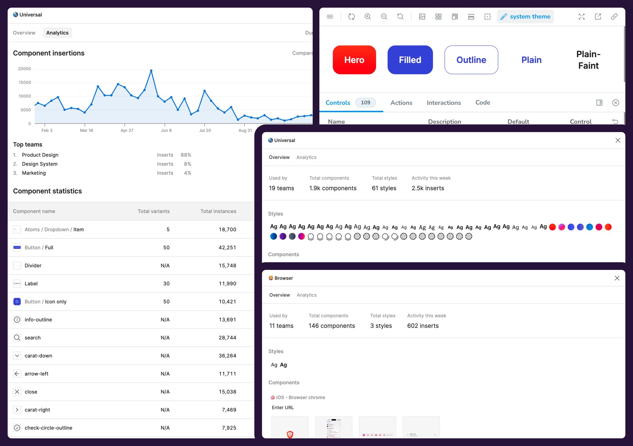
Platform libraries

The second layer addresses the unique requirements of different platforms:
Specific components and patterns for the desktop browser.
Material Design components and patterns for Android.
iOS-native design patterns.
Web-specific components.
Product libraries

The top layer enables product teams to maintain their unique identity and style, while staying within the broader design language:
Custom components for Brave Search.
Specialized UI patterns for Brave Wallet.
Unique elements for Brave News and Leo.
Of course, since most of our products live within the browser UI, there's a lot of cross-referencing between the different libraries: Our Wallet, for example, has implementations that live within the browser in all platforms, but also has a web version. So they all have to be in sync and make for a streamlined experience.

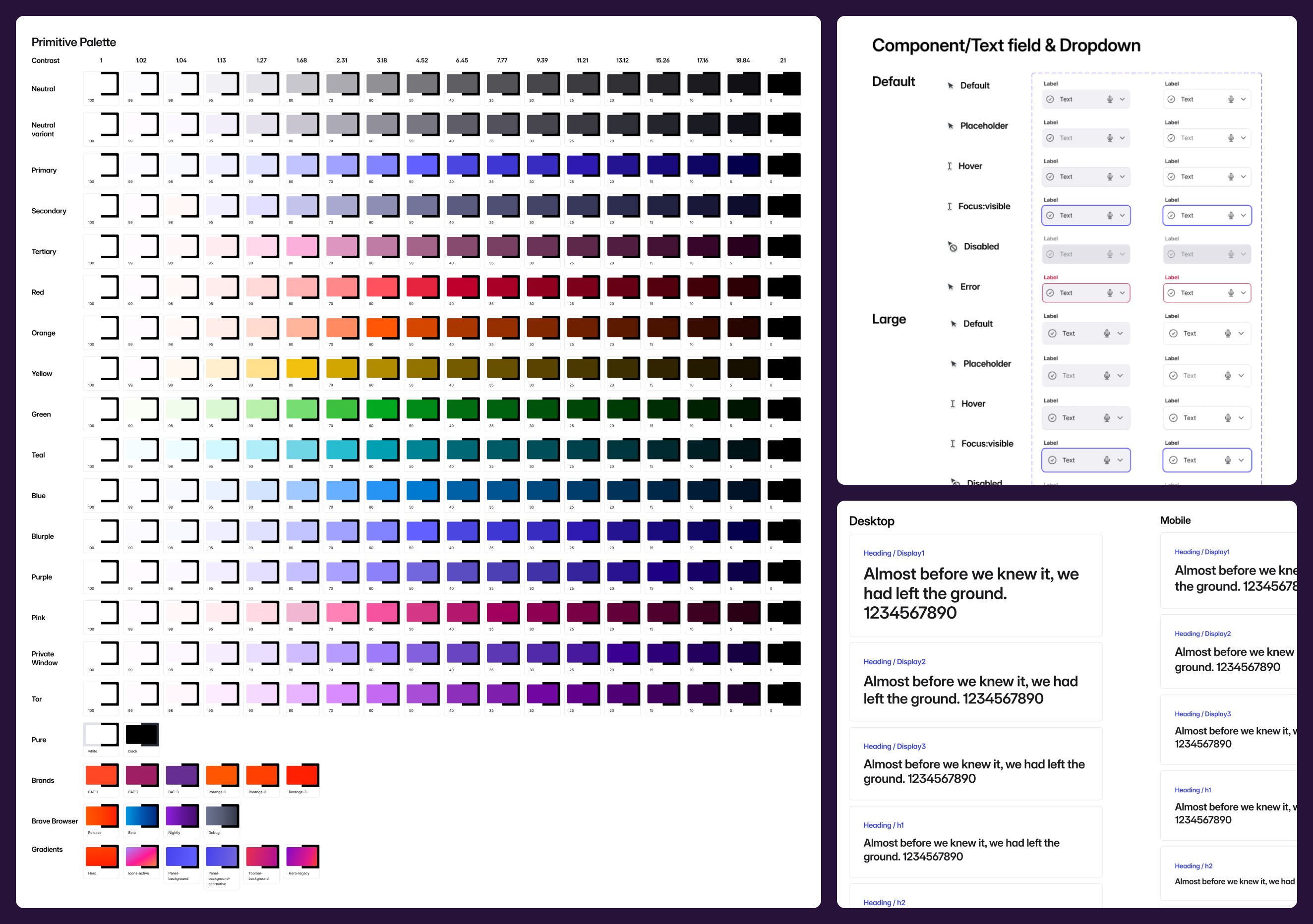
System architecture
Our token system is the result of a lot of work in bridging design and development. We implemented a custom Style Dictionary configuration that transforms Figma tokens into platform-specific code. The system handles
A color system that consists of 3 layers:
Primitive raw colors.
Themable light/dark versions of those colors.
Semantic tokens that make it very straightforward to choose a color for the right design piece.
Typography scale with responsive breakpoints and OS specific variables (MacOS / Windows / Android / iOS / Web).
Spacing and layout grid systems.
Shadows and other effects, like blurs, glass effects, etc.
Grid systems.
Component-specific tokens.
Animation and transition definitions.
Looking into the future
While I do have collaboration in design system from the other designers in their specific product libraries; this initiative is basically done as a team of one, so time is never my ally.
Eventually, I would like to create a portal for all the design system needs, like other companies have, where designers, developers, and even managers and creatives from other areas can take references of what they need and use those insights right away. Going through Figma or Storybook works ok for now, but having a place where examples, variations, and more can be broken down in a visual way would really help making full sense of the capabilities of Nala.
More projects

CASE STUDY
An AI agent that flows with you
How we created an AI agent that doesn't get in your way and helps you work better.
CASE STUDY
Reimagining the browser for productivity
Creating a set of features to increase productivity in the browser.
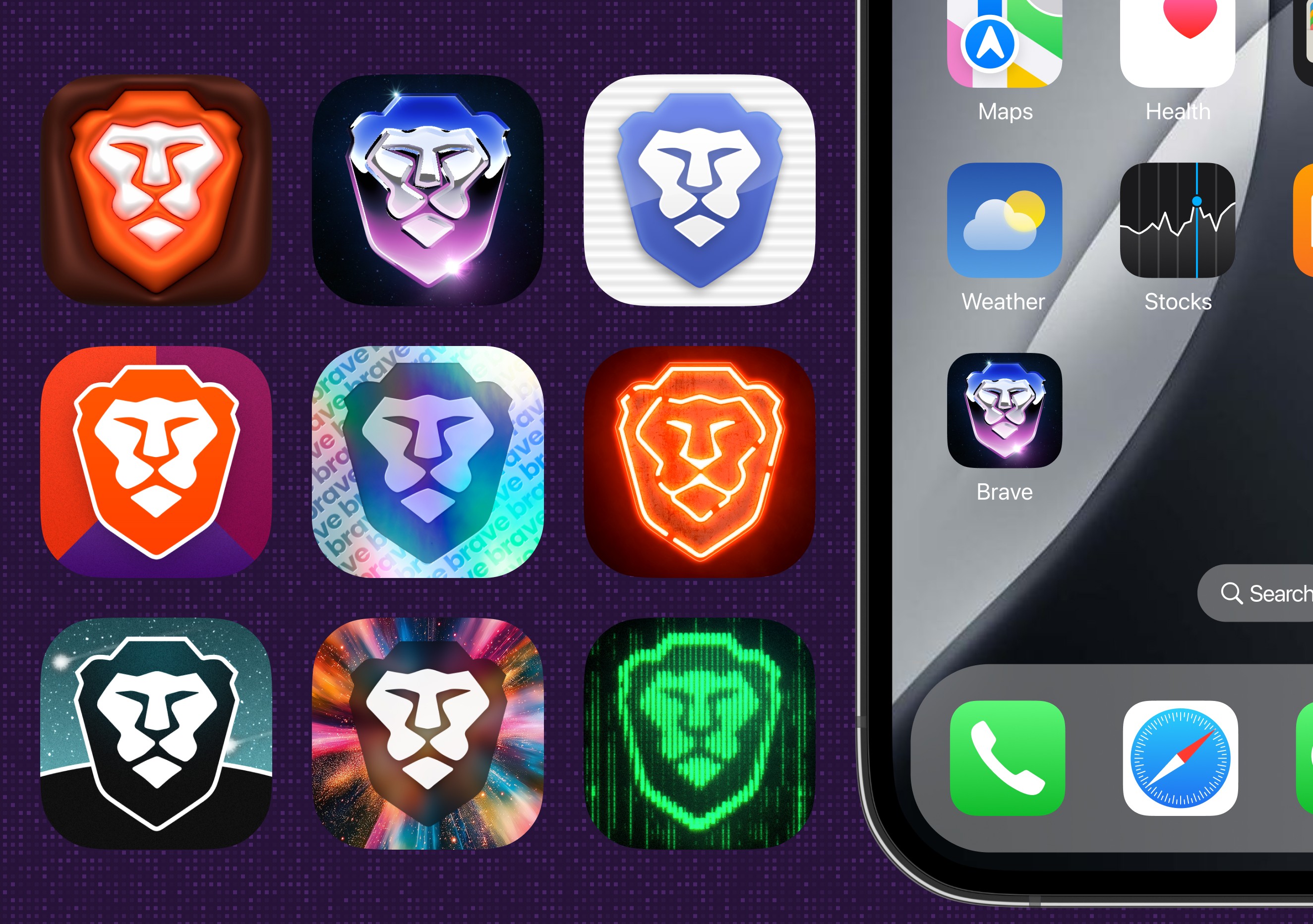
Custom browser icons
Adding fun ways to customize your home screen experience.
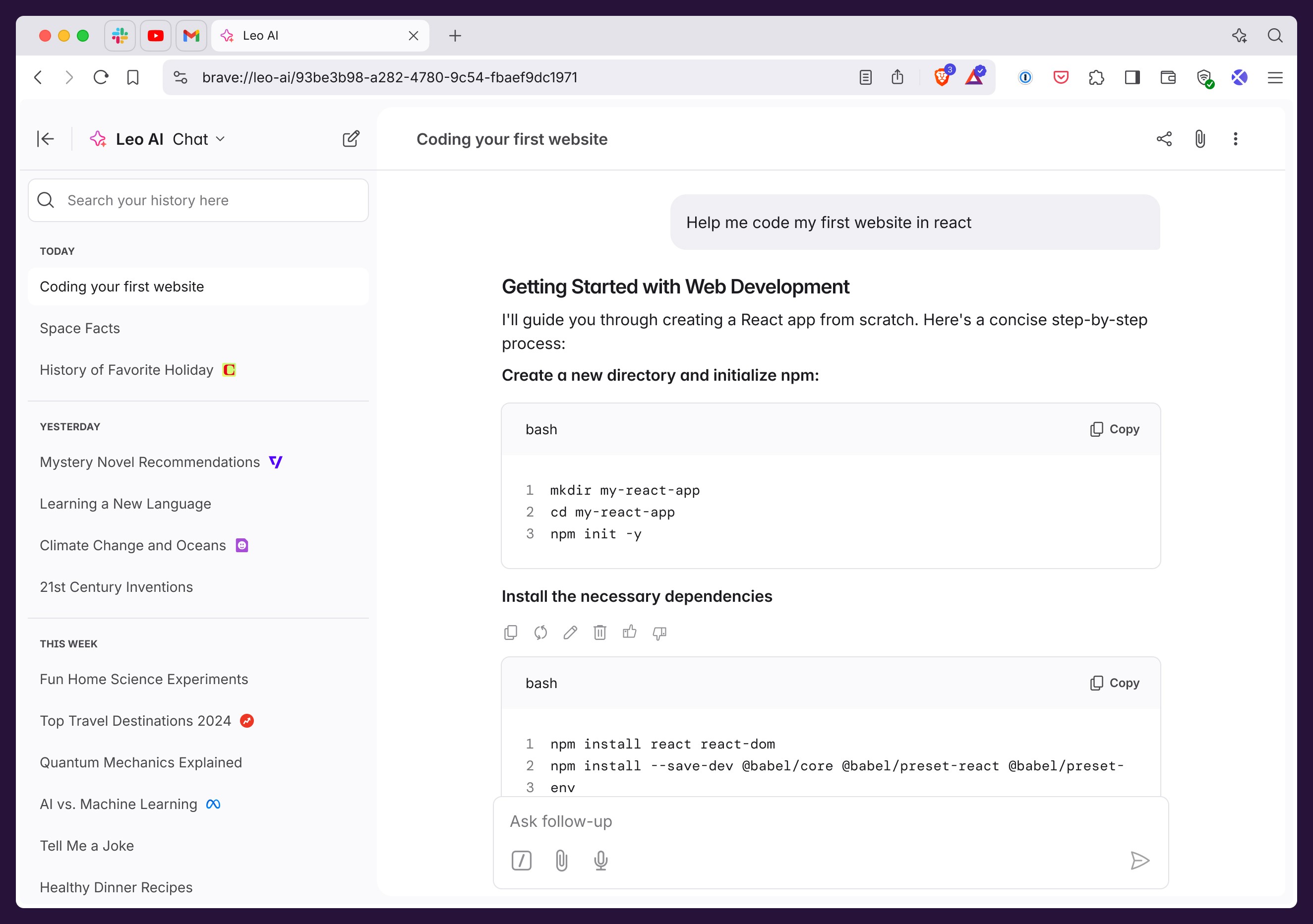
Leo AI webapp
Creating a more comfortable UI for deep work with AI.
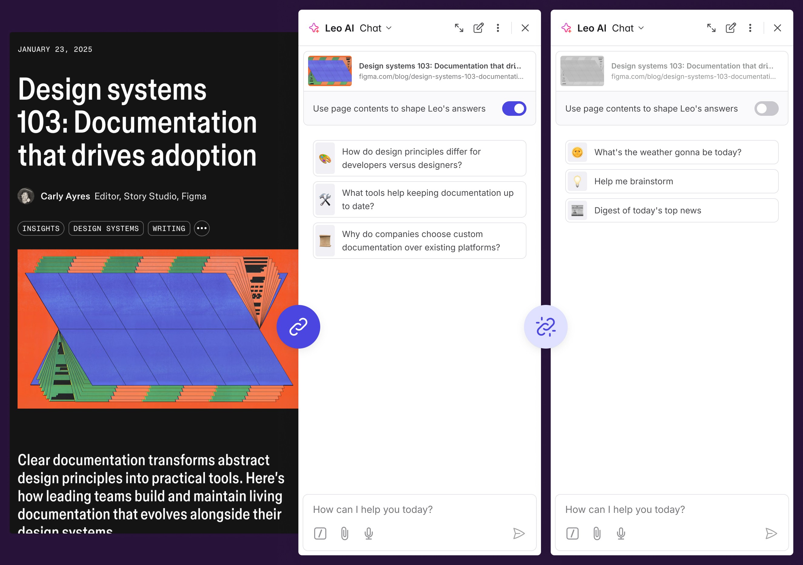
Contextual conversations with Leo AI
How we created an UX for easily adding the context of a webpage to an AI conversation.